
This month’s post is inspired by two things. Firstly, a wonderful textbook, a set pre-university text from my days as a maths student: https://www.amazon.co.uk/How-Lie-Statistics-Penguin-Business/dp/0140136290
Secondly, this:

A few days ago, this is how the UK government presented the daily coronavirus death toll in the UK.
[Source]
Deaths are rising, aren’t they? Yes, of course they are. But steadily according to the graph? Where’s that doubling every few days we were hearing about? Where’s that exponential growth?
Of course, it doesn’t take long to solve the mystery. Look at that y-axis – the one showing the number of deaths plotted against days (the x-axis). Instead of going 100, 200, 300, as we might expect, the main grid values go 100, 1,000, 10,000. Is that rather odd?
Well, it’s a particular type of graph. As you go up the y-axis, the ‘normal’ scale gets squeezed into less and less space. It’s called a logarithmic (log) graph and it’s used specifically to plot data that’s rising exponentially. In fact, it can be pretty useful. Not only does a straight line on a log graph indicate that the growth is exponential, measuring the slope of the line tells us just how exponential it is. (The factor each day’s figure is being multiplied by to get the next, which leads to the number of days it takes to double.)
If we plot the data on a ‘normal’ linear graph, we get something more like this:
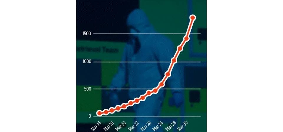 … which, unsurprisingly, does look properly exponential. [Worldometers/Reuters]
So is this dishonest?
Well, it’s unquestionably dodgy.
OK, statisticians and other scientists do use log graphs for valid purposes. Not just for the reasons given above but sometimes, more simply, because a large amount of exponential data won’t even fit on a linear graph.
But statisticians actually present data in all sorts of ways, depending on what they’re trying to do with it and/or what they’re trying to show.
And that’s the essential distinction. Are you trying to work with it or show it?
There’s a massive difference between needing to analyse data and to display it for information, particularly when it’s to be presented to the general public … most of whom – and this is critical – won’t know what a log graph is, what it’s used for or how it works.
Using a log graph to convey information in the public domain simply isn’t on.
Yes, it’s dishonest.
 There are potentially redeeming factors:
- It could have been a genuine mistake: incompetency, not deception?
- At least they put the figures on the y-axis: the close observer could at least notice that is was log graph. [It’s actually not unheard of to have graphs presented with no figures at all!]
You have to very careful when you represent data with any sort of image. Just consider something as simple as this …
‘Government contributions to such-and-such double’. So here’s a ‘before and after’ diagram:
 The image on the right is twice the height of the one on the left. That’s OK, isn’t it?
Well, no, it isn’t; not if we’re thinking people may take a visual message from it. Doubling lengths quadruples areas and multiplies volumes by eight. At the very least, the right-hand image looks four times the size of the left-hand image and, if we’re getting a 3D feeling from it then it looks eight times bigger. Even if the correct figures are given as well (as they are in the government’s graph), the visual image can be more immediate, stronger, and lasting. Reputable statisticians simply don’t do this kind of stuff!
But if you really want to get into the finer detail of how statistics can be used to mislead, I recommend the book itself.
Incidentally, I don’t have my copy of ‘How to Lie with Statistics’ any more. I lent it to a fellow political activist years ago and never got it back. He’s now the leader of a major UK city council! It’s a good book!


May 11th, 2020 at 7:52 am
[…] This really isn’t the way to present statistics! Although hardly the first time the government’s done that badly recently. […]