
Universities are being increasingly forced to take ‘league tables’ seriously and the next month or so will see a variety of versions appear but how useful really are they?

Movement up and down the ‘Complete University Guide’ league table for Computer Science
What do university league tables tell us? Well, if quantity alone is anything to go by, they tell us quite a lot. The Guardian, Times and Sunday Times, in particular have their own versions and we’ll be seeing all of those in time. But how much use is the data? And, to start with, why the need for so many versions? Surely they’d all be the same if they’re measuring the same thing?
Well, they’re not. They actually measure different things and combine those different things in different ways. Some for example consider research, some don’t, but those that do assign it more or less value. Most assess student satisfaction but, again, they weight its significance at varying levels. They each have their own formula and these formulae have different parameters. And some, but not all, break down their analysis into individual academic subjects. Naturally, it’s Computing – or more usually Computer Science – that we’re interested in here.
The first table to be published each year is the ‘Complete University Guide’ (CUG). That title might lead you to believe that it’s an amalgamation of all the others, in which case it should come last, but it isn’t, and it doesn’t. It comes first and it’s just another formula of its own choosing. In fact, it has fewer parameters than most of the others although what it loses in detail, it makes up for in no-nonsense simplicity. Also, all the tables are looking a year ahead of themselves so this year, for example, sees the publication of the 2015 Complete University Guide for Computer Science.
Purely using this as an example, because the new version’s available, the CUG uses four parameters:
- Average entry qualifications for a student entering a degree programme. (Intended to measure the ‘quality’ of students starting their courses; in a sense, a measure of how competitive or ‘hard’ the programmes are to get onto.) Counted in UCAS points – but usually at least a year (can be more) behind.
- Student satisfaction (according to the previous year’s National Student Survey – the current one has only just closed, the results won’t be ready until later in the year so these will feed into next year’s tables). The average of a scale from 1 (worst) to 5 (best).
- Research rating (according to the 2008 Research Assessment Exercise (yes, 2008!), the most recently published UK survey – the newest one is currently in preparation and will be available in 2014/2015). A weighted average on a scale of 0 (awful) to 4 (brilliant).
- Employment prospects (calculated as the percentage of graduating students from Computing programmes who find jobs matching their skills – i.e. not MacDonalds). Again, taken from the previous year’s figures at best.
(So clearly a lot of this data is ‘historical’ to a greater or lesser extent.) Now, each of these is values converted to an equivalent scale then combined with equal weighting into an overall figure. The complete table is very large but, for a compact example to work with, the detailed results for Wales are these …
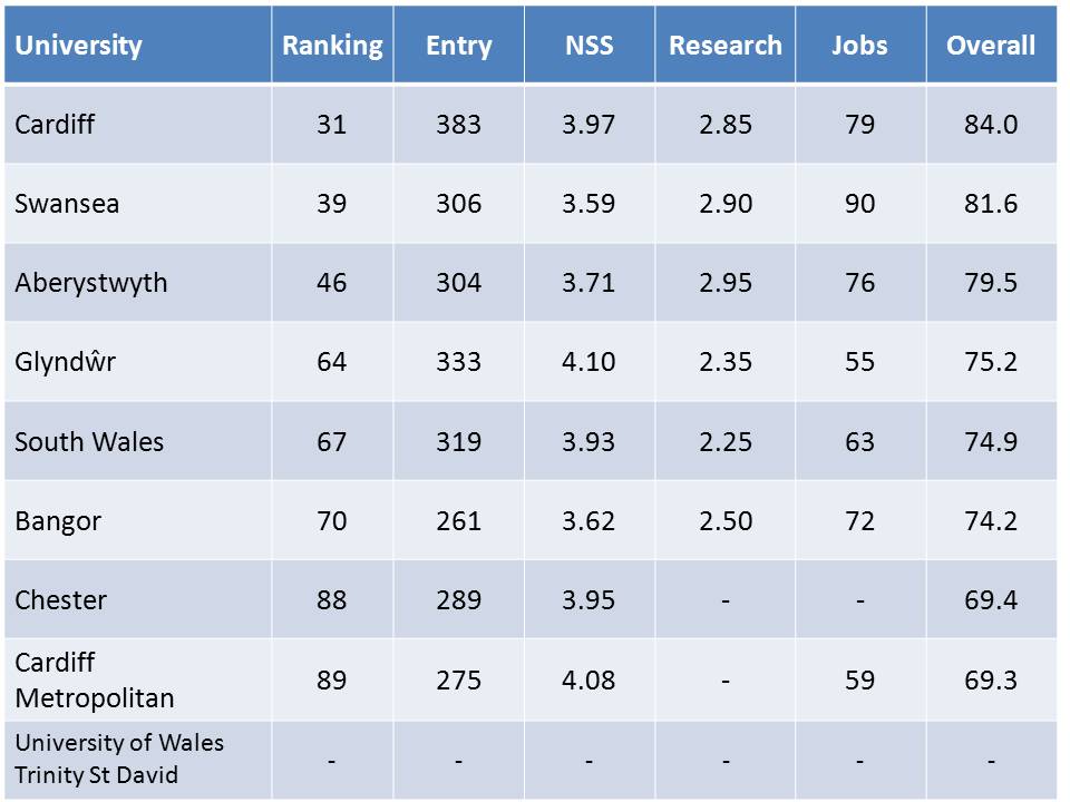
(These figures include Chester University for comparison since Chester and North Wales are sometimes combined as an administrative region – for British Computer Society (BCS) branch purposes, for example. No figures were available for the newly-formed UWTSD. Note that Chester and Cardiff Met. did not submit to the 2008 RAE and no employment figures were available for Chester. Key – Ranking: current position in table; Entry: average student UCAS points; NSS: national student satisfaction survey; Research: national research assessment exercise; Jobs: employment success %; Overall: average of Entry, NSS, Research and Jobs)
OK, so what does all this tell us? Well, to some extent, the results speak for themselves; the order is probably about right But that’s not to say there’s no room for an odd calculation or two along the way; there is. The particular peculiarity with the CUG is the way it deals with missing or unavailable data. In particular, it doesn’t make any distinction between data it can’t find and data that was never there.
The CUG calculation is to take the average of all the data it can get – if that’s two, three or all four values – but to leave out the university in question if it can only find one or can’t get any at all (such as for UWTSD above). There’s a subtle and and an obvious flaw with this approach. The subtle problem is that there might be bias between the data available and not available, particularly if external bodies are reliant upon the university to produce it. (Would you go out of your way to release unflattering data?)
The more obvious one is that some omissions do actually mean ‘nothing’. A gap in the ‘Research’ column, for example, means that that university didn’t enter that subject to the RAE exercise, usually because it wasn’t strong enough. (OK, research assessment submissions are ‘strategic’ sometimes but strong research areas are rarely overlooked.) To average across the other measures is to effectively overlook a weak research area. Or, in fact, it means that a department with no research could score higher than one with reasonably good – but not great – research. This is just an example.
And the other league tables are no better or worse – just different. And these will be appearing soon. They each have their formulae and their own idiosyncratic flaws. They include, exclude and weight factors according to their own particular whim but are all highly reliant on both the availability and accuracy of the source data they need. Does this make them pointless and valueless?
Well, probably not, for two reasons, coming at the question from different directions … cause and effect:
- There is a surprising amount of consistency among the various tables. Even with their different approaches, the placings and relative orders of universities don’t vary that much. In particular, a large move up (or down) any table (see the first chart above) is usually reflected in the others and probably indicates a healthy (or unhealthy) subject. Relative measures can often give more meaningful information than absolute ones.
- Both students and external bodies are taking league tables increasingly seriously. Naturally, a student wants to study at the best university they can but others are basing decisions upon them too. Many countries’ governments will only fund students for overseas study, for example, at universities placed high enough in their subject tables. In either case, if this is the only data you’ve got, this is what you use.
So, yes, they’re flawed. Any purely data-driven system is bound to be but they’re far from useless and – more significantly – they matter – irrespective of what we might think of them. And that’s the important point; love them or hate them, we can’t ignore them.
Get used to seeing university league tables; they’re not going away …


So what do you think?